Online Product Design
Now complete your navigation system by adding the rest of your links using #F3468F for colors and wide spaces between each link.

Again with your text tool type “D” using font Webdings, 30 pt, crisp and #FFFFFFF for color. This will be your first icon which symbolize your first link.
In your layer palette add the following layer styles:
Stroke

Icons used in this tutorial are found in font Webdings. @, ), e, J, >, D are the letters and symbols.

Select your rounded rectangle tool and set its radius setting to four pixels. In your layer palette create a new layer set, name it Purchase. In a new layer just below your header structure, create a 454 x 30 pixels, white round rectangle.
In your layer palette add the following layer styles:
Stroke

Add “Purchase Now” text using font Arial, bold, 15 pt, crisp and #F24789.

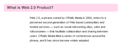
In your layer palette create a new layer set, name it Product. Make a new layer then create a #FFD8EC round rectangle under your purchase tab.

Now add a title that fits your product, use font Arial, bold, 15 pt, crisp and #474747 for color.

Add your content for this section, use font Arial, regular, 11 pt , none and #1F1F1F for color. In your character palette set the leading to 18 pt.

May 31st, 2007 at 6:38 am
[…] Go to Tutorial […]
June 25th, 2007 at 2:46 am
Look right in the template’s full view, it even says that web 2.0 has to do with social networking and the type of content the site has to offer. I like this design, but the design of a site has NOTHING to do with being web 2.0. Web 2.0 just means it’s more user driven and interactive, which doesn’t have dick to do with being a plastic website.
June 25th, 2007 at 7:20 am
Web 2.0 is also a style in designing = Simplicity.