Online Product Design
Open a new document with a 1000 x 720 pixels, white canvas. In your layer palette create a new layer set, name it Header. Create a new layer, on the center of your canvas draw a 896 x 120 pixels, #F24385 rectangle.
In your layer palette add the following layer styles:
Inner Shadow
Gradient Overlay
Pattern Overlay

Under your pink rectangle, draw a 1000 x 96 pixels, black rectangle.
In your layer palette add the following layer styles:
Inner Shadow
Gradient Overlay

At the end of your pink rectangle, draw a 1000 x 6 pixels, #EF366B rectangle.
In your layer palette add the following layer styles:
Drop Shadow
Gradient Overlay

Back to your Header layer set, add your name using font Arial, bold, 23 pt, crisp and #E8E8E8 for color.
In your layer palette, set your layers blending mode to Soften Light and add the following layer styles:
Drop Shadow
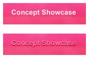
Again add your name using the same character settings provided from step four.
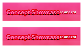
In your layer palette, set your layers blending mode to Darken and add the following layer styles:
Stroke

Add your slogan using step fours instruction. Instead of Soften Light for your first text layer, keep it on normal setting.
To make it extra special add a logo, type “#” with text tool using font Webding, 72, crisp and #E8E8E8 for color.
In your layer palette add the following layer styles:
Gradient Overlay

In your layer palette create a new layer set, name it Navigation System. With your text tool add your first navigation using font Verdana, bold, 18 pt, crisp and #FFFFFF for color.

May 31st, 2007 at 6:38 am
[…] Go to Tutorial […]
June 25th, 2007 at 2:46 am
Look right in the template’s full view, it even says that web 2.0 has to do with social networking and the type of content the site has to offer. I like this design, but the design of a site has NOTHING to do with being web 2.0. Web 2.0 just means it’s more user driven and interactive, which doesn’t have dick to do with being a plastic website.
June 25th, 2007 at 7:20 am
Web 2.0 is also a style in designing = Simplicity.